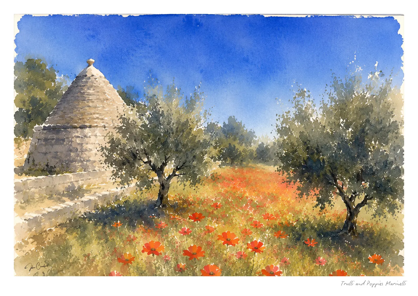
There are parts of Italy that seem almost designed for watercolour.
Puglia is one of them.
Perhaps it is the light. Or the contrast between brilliant white buildings and an impossibly blue sky. Perhaps it is the old stone, faded shutters and olive trees, or the way a narrow street can suddenly end with a glimpse of the Adriatic.
Whatever it is, I find myself looking at Puglia differently when I have a paintbrush in mind.
I’m not really searching for the famous view. Quite often it is something much simpler that catches me: a fishing boat tied against an old harbour wall, a doorway disappearing into shadow, washing hanging above a street, or sunlight falling across a building that has probably looked much the same for generations.
Those are the moments I want to remember.
And, increasingly, they have become part of The Watercolour Atlas.
Monopoli: where the old town meets the sea
Monopoli is probably the place I return to most often in my Puglia paintings.
The old harbour, Porto Antico, has almost everything a watercolour painter could ask for. Little blue fishing boats, pale stone walls, reflections on the water and the jumble of the old town behind. Inland, Ostuni offers a different lesson in painting Puglia’s light, where whitewashed walls hold reflected blue, warm cream and violet shadow.
But what interests me most is the light.
In the middle of the day it can be incredibly strong. Buildings almost disappear into it, while beneath balconies and archways the shadows become deep blues, violets and greys.
Watercolour is particularly good at this.
You don’t need to describe every window or every stone. Leave part of the paper untouched and it becomes sunlight. Let two washes run together and suddenly there is a reflection in the harbour.
The temptation is to paint everything.
Usually, the painting becomes more interesting when you don’t.
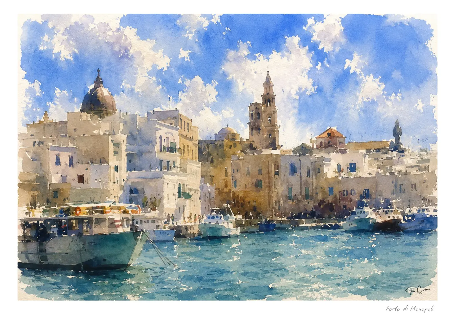
View Porto di Monopoli and choose a print →
There is more about the harbour and old town in Monopoli, Puglia: Where the Adriatic Meets the Old Town.
Alberobello: painting shapes rather than details
Alberobello presents a different problem.
The trulli are so distinctive that it’s very easy to become preoccupied with drawing them accurately. Conical roofs, white walls, little windows, stone details. Before long you’re illustrating architecture rather than making a painting.
I prefer to simplify them.
A few roof shapes establish Alberobello immediately. After that, I’m more interested in how those shapes overlap, where the sunlight falls and how the white buildings pick up colour from everything around them.
And white, of course, is rarely simply white.
There might be a little ochre reflected from the ground, blue from the sky or violet-grey sitting in the shadows.
Watercolour allows those colours to mingle rather than defining everything too precisely.
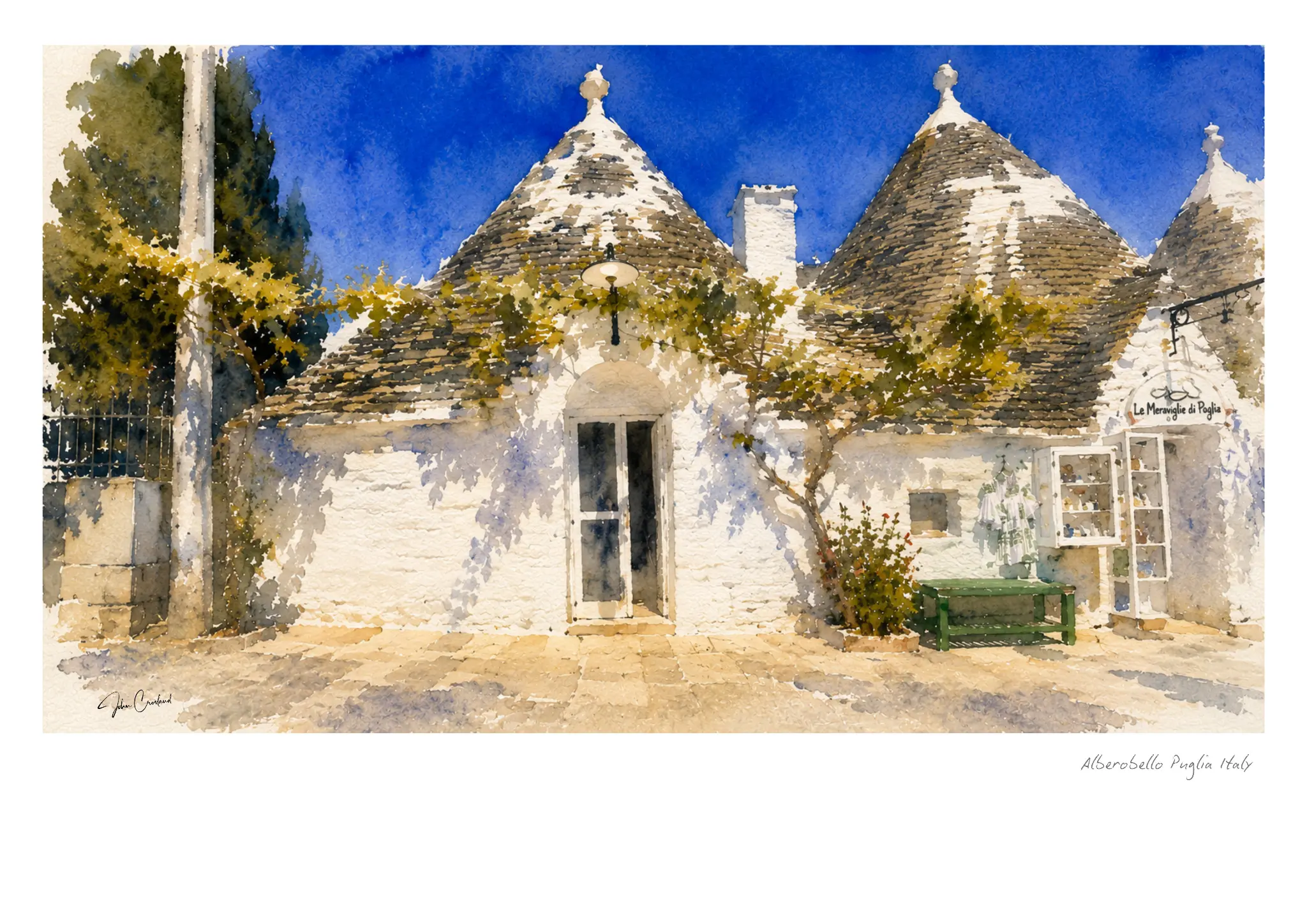
View Among the Trulli and choose a print →
Read more about painting Alberobello and its trulli in watercolour.
The stone towns of inland Puglia
Move away from the coast and Puglia changes.
The blues become less dominant. Warm stone, terracotta, dusty greens and bleached earth begin to take over.
Places such as Altamura and the smaller towns of the interior have a different rhythm from Monopoli. I returned to that stone palette in a closer story about Altamura Cathedral's carved lions.
Here I find myself looking for old walls, church towers, piazzas and streets where the buildings seem to grow out of the same stone beneath them.
For a painter, that restricted palette can be wonderful.
You don’t necessarily need lots of colour. A warm wash across the paper, a cooler shadow and perhaps one stronger accent can be enough.
And sometimes that restraint says more about a place than trying to reproduce every colour you can see.
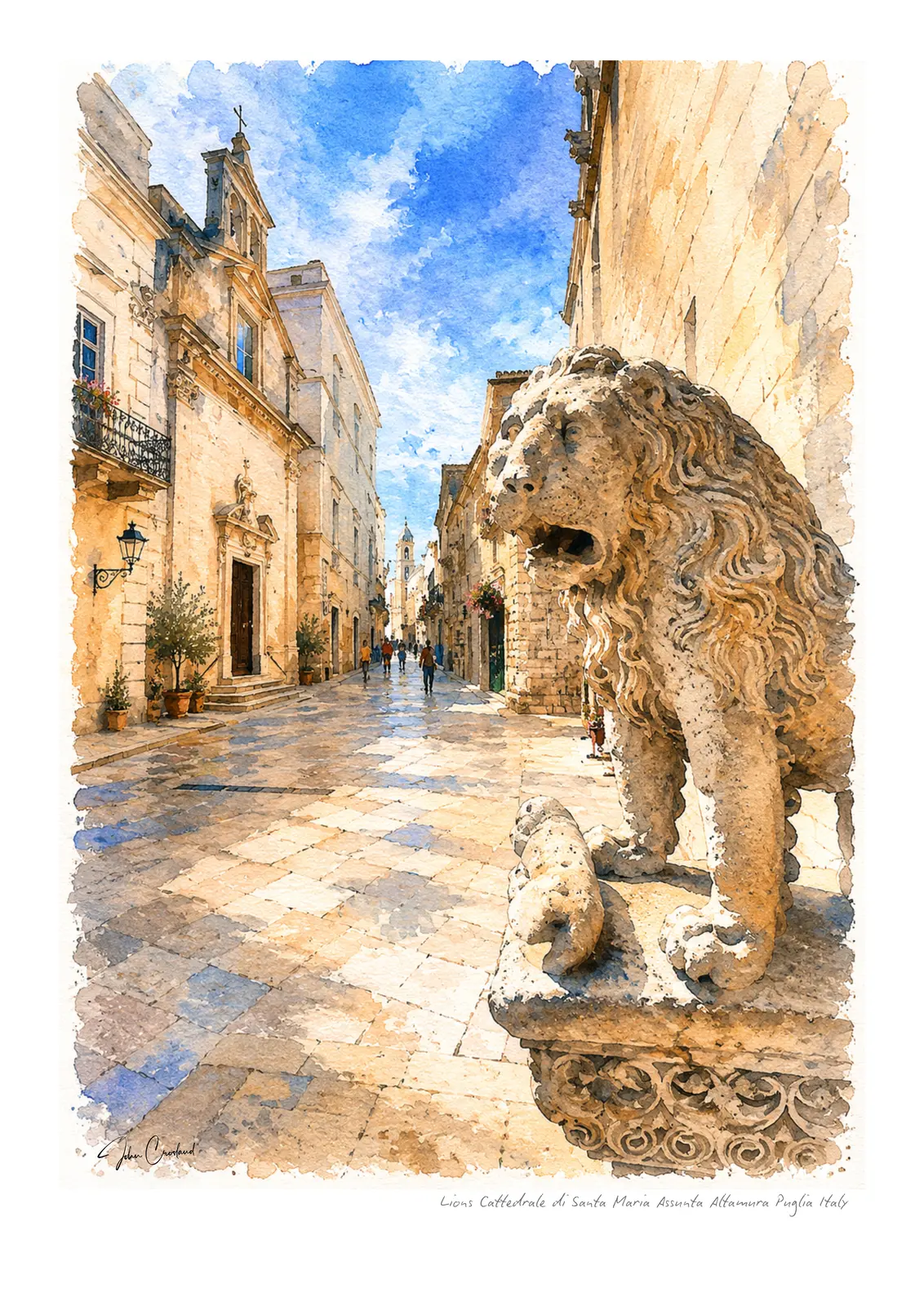
View Lions of the Cathedral and choose a print →
Along the Adriatic
The Adriatic keeps reappearing in my memories of Puglia.
Sometimes it dominates the view. Elsewhere you only catch it briefly at the end of a street.
The coastline gives Puglia a particular quality of light. Blues bounce into shadows. Pale stone takes on unexpected colours. Even the brightest midday scenes contain subtle changes in temperature.
There are old watchtowers, rocky coves, harbours and stretches of coastline where the architecture feels almost secondary to the sea and sky.
These are scenes where I particularly enjoy allowing the watercolour to behave like watercolour.
Edges can disappear. Pigments can run into one another. A sky doesn’t have to stop neatly where a building begins.
Sometimes the accidents are the best part.
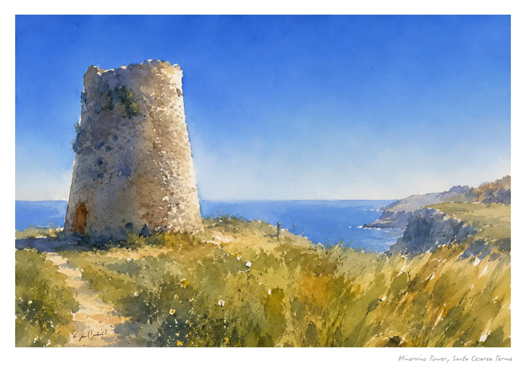
View Minervino Tower and choose a print →
The story of Minervino Tower near Santa Cesarea Terme looks more closely at that meeting of stone, wildflowers and open sky. Inland, Locorotondo's rooftops offer a different kind of silhouette.
What I leave out
Painting while travelling has gradually taught me that choosing what not to paint is probably as important as deciding what to include.
A photograph records almost everything.
A painting doesn’t have to.
I might remove a parked car, simplify a row of windows, move a figure slightly or allow half a building to disappear into the light.
It isn’t about making Puglia prettier than it really is.
It’s about remembering what made me stop in the first place.
That might have been the blue of a fishing boat. The shadow beneath an arch. A church tower against the sky. Or simply the feeling of turning a corner and seeing the Adriatic at the end of the street.
Those are the things I want the painting to hold onto.
Places remembered in watercolour
The Puglia collection will continue to grow.
There are still towns, coastlines and small moments I want to paint, and inevitably there will be places I haven’t discovered yet.
That’s partly what I like about The Watercolour Atlas.
It isn’t intended to be a catalogue of everywhere I’ve been. It’s something slower and more personal: a collection of places that stayed with me long enough to eventually find their way onto paper.
Puglia has already claimed quite a few pages.
I suspect it isn’t finished with me yet.