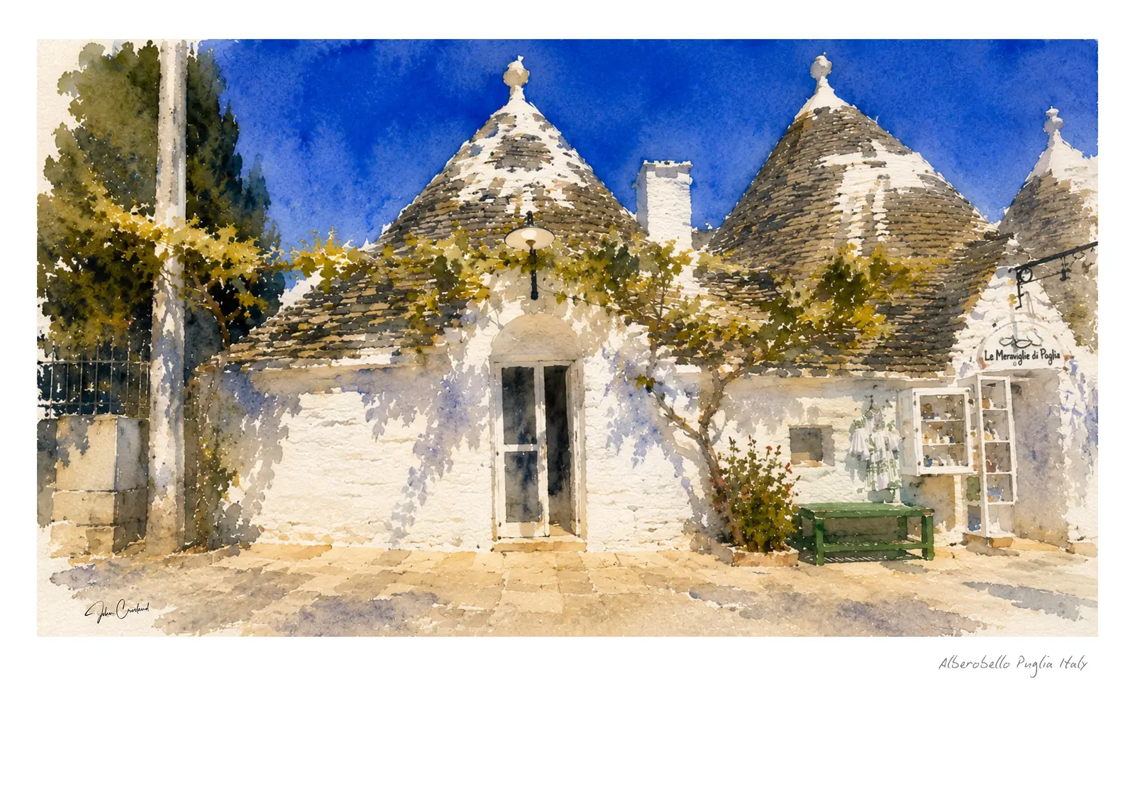
Alberobello is one of those places that seems already illustrated before the paintbox comes out. The conical roofs, white walls and winding lanes are so distinctive that the real challenge is not recognition. It is finding something personal within a very familiar view.
Seeing beyond the postcard
A row of neat trulli can quickly become a pattern of triangles and rectangles. I look instead for irregularity: one roof leaning into another, a dark doorway interrupting the white, weeds at the base of a wall or a chimney caught against the sky.
Those small differences stop the architecture becoming a symbol. They return it to the scale of homes and streets, shaped and changed by the people who use them.
Keeping white walls full of colour
White buildings are never simply painted with white. Their form comes from the colours around them: warm cream in sunlight, pale cobalt reflected from the sky and muted violet in the deepest shade.
I leave much of the paper untouched and allow transparent washes to meet at soft edges. A few stronger darks then establish doors, eaves and the gaps between buildings without outlining every shape.
Stone roofs and loose brushwork
The roofs carry the character of the trulli, but describing every stone would make the painting rigid. Dry brush and granulating pigment suggest their rough surface more naturally than careful repetition.
Plants, poppies and open sky provide a useful counterpoint. Their softer, less predictable marks keep the geometry from taking over and help the picture retain the feeling of a travel sketch.
Choosing an Alberobello print
The closer street studies suit A3 and A2, where the paper edges and individual brush marks remain intimate. Wider views can carry a larger format and work well as a focal piece in a kitchen, hallway or relaxed living space.
Light oak and white frames echo the pale stone, while black gives the rooftops a more graphic contemporary edge. The framing visualiser lets you compare each presentation before ordering.