
From across the olive country, Ostuni seems to gather itself into one pale shape above the land. Come closer and the supposed whiteness breaks apart into colour.
There is blue reflected from the sky, warm cream where the sun catches old plaster, grey-violet beneath an arch and sudden ochre where limestone has been left uncovered. A green shutter or a terracotta pot can hold an entire street together.
That is the first pleasure of painting Ostuni. The town is known for being white, yet a painter soon realises that white is only the beginning.
I am not trying to make an architectural inventory of the place. What stays with me is the way the town rises above the landscape, then changes completely when you enter it: broad shape becoming steps, alleys, shadows and fragments of sky. A painting can hold both impressions, even if it leaves a great deal unsaid.
Why Ostuni is called the White City
Ostuni is widely known as La Città Bianca, the White City, because of the limewashed buildings clustered through its historic centre. The old town occupies a hill in the Valle d’Itria, within reach of the Adriatic, and from a distance its pale mass is unmistakable against the olive landscape.
Limewashing has practical as well as visual roots. The bright surfaces help reflect the fierce southern sun, while the repeated coating of walls became part of the character of the town. What appears uniform from afar is anything but uniform at street level. Plaster flakes, stone shows through and every wall receives light from a slightly different direction.
At the top of the old town stands Ostuni Cathedral, built in the 15th century and recognised by its richly worked façade and large rose window. It is a landmark, of course, but Ostuni does not depend on one monument. The town’s visual character comes from the accumulation of ordinary walls, stairs, passages and roofs, all responding to the same intense light.
White is never really white
In watercolour, the brightest white is usually the paper itself. Once it has been painted over, it is difficult to recover with the same freshness, so painting a white town requires a little restraint. The question is not simply where to add colour. It is where to stop.
Leaving the paper untouched can create the flash of sunlight on a wall. Beside it, a dilute wash of cobalt, ultramarine or violet-grey may be enough to turn the next wall away from the light. A warmer wash near the ground can suggest dust, reflected stone and heat. None of these areas needs to be described heavily. Their relationship makes the architecture believable.
The shadows matter just as much. Beneath Ostuni’s arches and within its narrow lanes, they can appear almost solid after the glare outside. But they are rarely black. Cool blue, violet and soft green move through them, sometimes interrupted by a warm reflected edge. Watercolour allows those colours to meet and settle on the paper without becoming too fixed.
Against all that pale architecture, the sky has unusual force. A relatively small area of blue can define the heat of the day, sharpen a roofline or turn a white wall luminous. Blue against white sounds simple. In practice, it contains an extraordinary range of choices.
Walking the old town
Ostuni is better understood by wandering than by moving efficiently from one named sight to another. The historic centre folds around the hill in lanes that climb, narrow, turn beneath arches and open unexpectedly onto terraces or fragments of distant landscape.
For a painter, each turn changes the composition. A stairway can become a strong diagonal. An arch can frame a small area of blue sky. Two close walls can reduce the scene to a near-abstract arrangement of light and shadow. Then the street opens and the clustered town, olive groves or horizon reappears.
I tend to notice the transitions. The moment a bright wall slips into shade. The narrow slice of sky between buildings. A handrail, doorway or plant that interrupts a large pale shape. These details give scale and rhythm, but they do not all need to survive into the painting.
That is why I prefer walking without treating Ostuni as a checklist. The most paintable view may not be the grandest one. It may be a small interruption in the white: steps worn smooth, a doorway held in cool shadow or a warm stone edge catching the light.
The light in Ostuni
Midday light simplifies Ostuni. The brightest planes can seem to lose their surface altogether, while shadows beneath balconies and arches become deep and sharply cut. It is dramatic, almost graphic, and useful when a painting needs a clear pattern of light and dark.
It is also unforgiving. If every edge is drawn and every shadow filled too heavily, the result can become hard. I prefer to let some boundaries disappear. A sunlit building may merge into the untouched paper; a shadow can soften as it runs down a wall. The eye accepts the missing information and the painting keeps some air.
Later in the day, the town changes character. Shadows lengthen across steps and façades. The white walls begin to hold warmer creams, pinks and muted golds, while shaded areas become less abrupt. The hilltop silhouette remains, but the mood is quieter and more reflective.
Neither light is more truthful. They are different memories of the same place. Midday gives structure and brilliance. Late afternoon gives warmth, depth and a sense of time passing. Watercolour can suggest both without labouring every surface.
Finding the painting
I rarely begin by asking how I can record everything in front of me. The more useful question is what made me stop.
In Ostuni it might be the whole town lifting above the landscape, or it might be the weight of a shadow below an arch. Once that first response is clear, the rest can be edited around it. Buildings can be simplified, windows reduced to a few marks and incidental clutter left out. Sometimes a shape is moved slightly to make the composition work.
This is not about improving the town or turning it into an idealised scene. It is about giving the painting a memory to hold onto. A photograph can preserve thousands of details with equal certainty. Memory does something else. It keeps the bright wall, the blue distance, the heat, the climb and perhaps one unexpected colour.
That selective quality is central to The Watercolour Atlas. I want the paintings to feel observed, but not pinned down. A place should have room to breathe and the viewer should have room to bring their own memory to it.
Ostuni in watercolour
The existing Ostuni paintings approach the town from two different distances. Together they describe something of the shift that happens when a landmark on the horizon becomes a lived-in place.
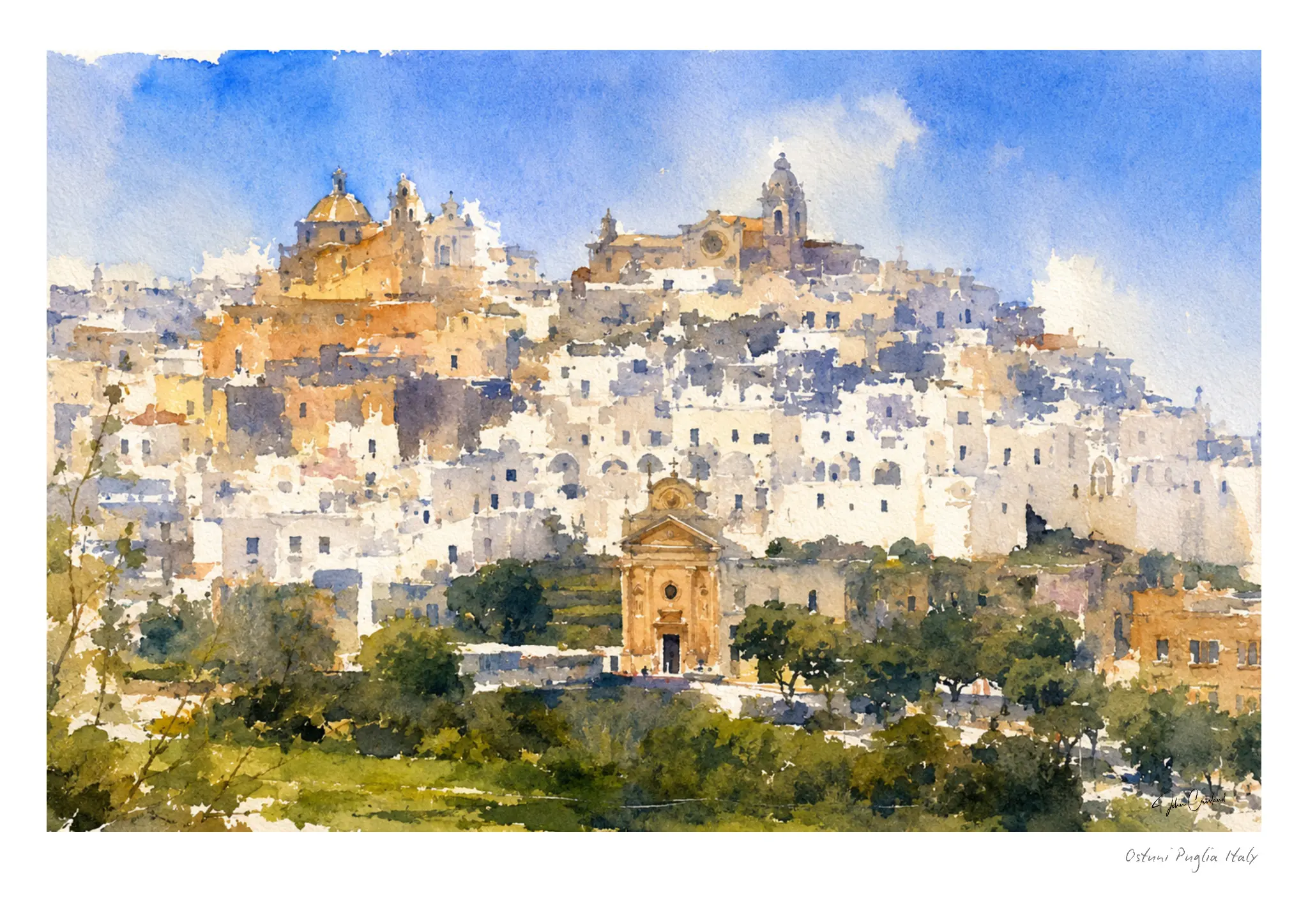
View Ostuni on the Hill and choose a print →
Ostuni on the Hill begins with the distant impression: a town that seems almost suspended between olive country and sky. The buildings are allowed to gather into a larger rhythm rather than being separated into an inventory of façades. What matters is the rise of the hill, the clustered white and the feeling of light across the whole.
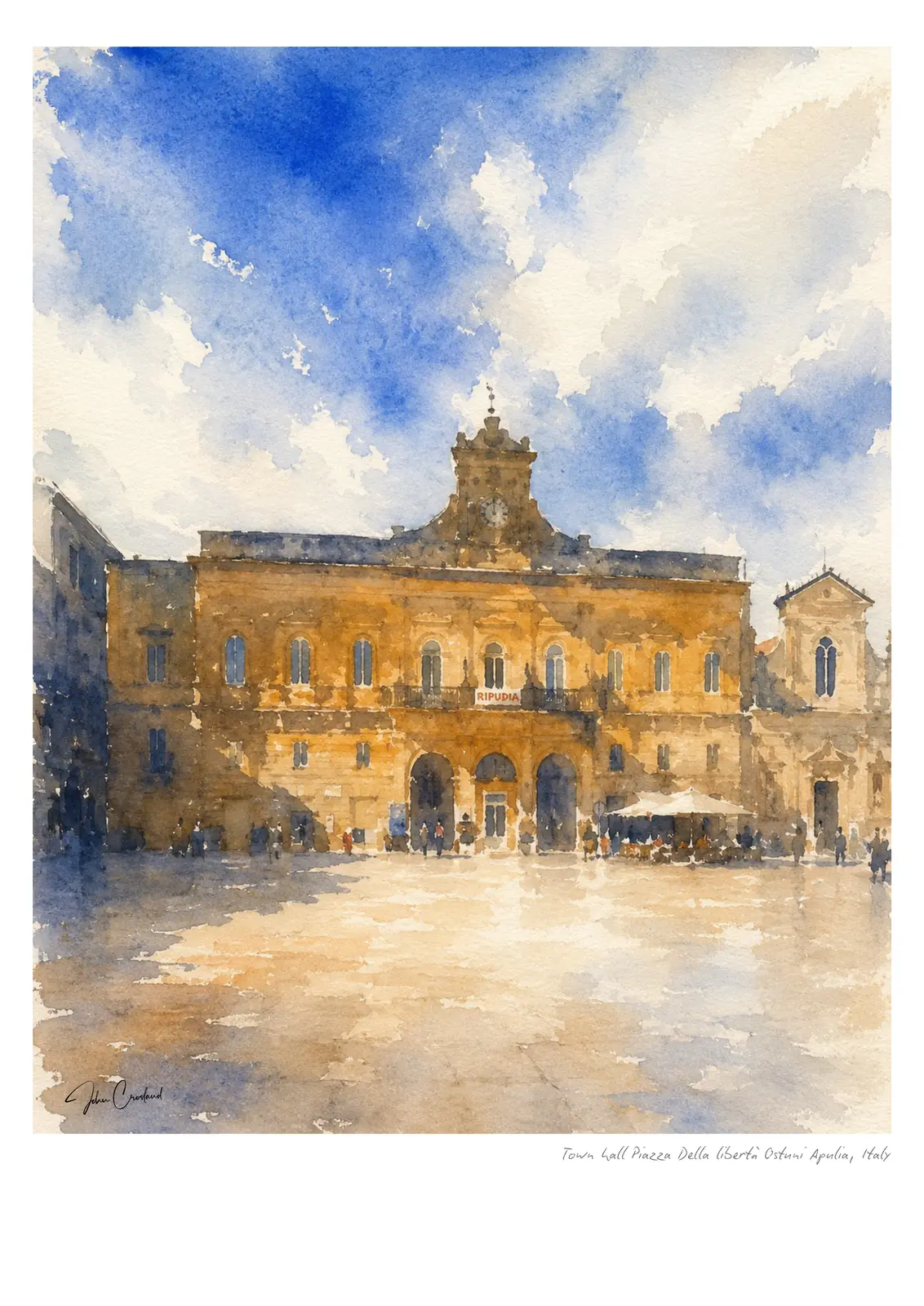
View Town Hall, Piazza della Libertà and choose a print →
Town Hall, Piazza della Libertà comes closer. Here the interest lies in the relationship between the architecture and the open square, where warm stone and shadow interrupt the idea of a completely white town. It is another side of Ostuni, less about silhouette and more about the character found inside it.
Explore the Ostuni watercolour collection →
Exploring more of Puglia through watercolour
Ostuni belongs to a wider painted journey through Puglia. Its whiteness connects naturally with the trulli of Alberobello; its hilltop presence offers a counterpoint to the blue boats and Adriatic edges of Monopoli. Across the border in Basilicata, Matera shifts the palette again towards weathered limestone, ravines and ancient stone.
Each place asks for a different kind of looking. Together they form a regional story of white walls, warm rock, blue water, deep shadow and the changing southern light. That story is gathered in A Painter’s Guide to Puglia, and across the wider Italy collection.
Ostuni may be called the White City, but what I remember is not a single colour. It is the movement between colours: blue reflected into plaster, ochre stone warming in the afternoon and violet shadow gathering beneath an arch. The white simply makes us look more closely.