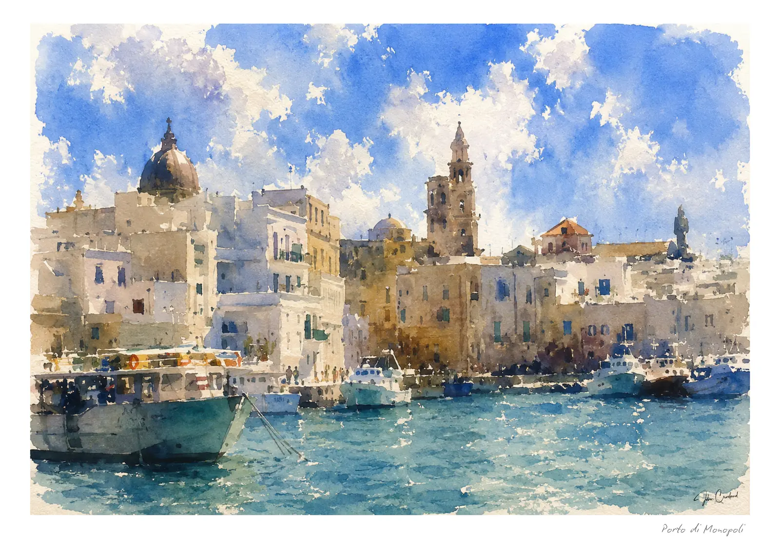
Monopoli’s old harbour has all the ingredients that make watercolour tempting: white boats, blue-green water, warm stone and reflections that change before there is time to become too precise.
The harbour as a composition
Boats can easily become a collection of separate objects. I begin with the larger movement of the harbour: the curve of the wall, the band of water and the light mass of buildings behind it.
Once that structure is settled, a few hulls, masts and red or blue accents are enough to create activity. Not every boat needs the same degree of attention.
Letting water behave like water
Reflections are most convincing when they are allowed to move. I place colour into damp paper and let vertical marks break into the surrounding wash rather than copying a reflection exactly.
Areas of untouched paper become flashes of light. Deeper turquoise and cobalt gather beneath the boats, giving them weight without drawing hard outlines around every hull.
Warm stone against Adriatic blue
The pleasure of Monopoli lies partly in complementary colour. Honeyed walls feel warmer beside the blue water, while cool shadows make the sunlit facades brighter.
Keeping the sky relatively simple helps. If every part of the painting competes for attention, the easy openness of the harbour disappears.
Living with a coastal watercolour
Harbour paintings bring colour into a room without feeling loud. They work naturally with pale walls, timber, linen and the softer blues often found in coastal or Mediterranean-inspired interiors.
A mounted presentation adds calm space around the busier boats and reflections. An unmounted frame feels more immediate, while an unframed print gives you the freedom to match an existing room.